Как добавить кнопку внутри ввода
Я пытаюсь достичь этого:
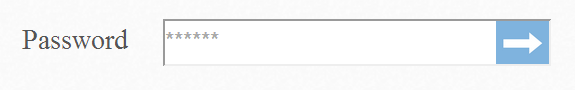
Я хочу, чтобы синяя стрелка действовала как кнопка с триггерами наведения и onclick; Возможно ли это??
5 ответов
кнопка не находится внутри входа. Здесь:
input[type="text"] {
    width: 200px;
    height: 20px;
    padding-right: 50px;
}

input[type="submit"] {
    margin-left: -50px;
    height: 20px;
    width: 50px;
}
пример:http://jsfiddle.net/s5GVh/
Я нашел отличный код:
HTML-код
<form class="form-wrapper cf">
    <input type="text" placeholder="Search here..." required>
    <button type="submit">Search</button>
</form>
в CSS
/*Clearing Floats*/
.cf:before, .cf:after {
    content:"";
    display:table;
}

.cf:after {
    clear:both;
}

.cf {
    zoom:1;
}
/* Form wrapper styling */
.form-wrapper {
    width: 450px;
    padding: 15px;
    margin: 150px auto 50px auto;
    background: #444;
    background: rgba(0,0,0,.2);
    border-radius: 10px;
    box-shadow: 0 1px 1px rgba(0,0,0,.4) inset, 0 1px 0 rgba(255,255,255,.2);
}

/* Form text input */

.form-wrapper input {
    width: 330px;
    height: 20px;
    padding: 10px 5px;
    float: left;
    font: bold 15px 'lucida sans', 'trebuchet MS', 'Tahoma';
    border: 0;
    background: #eee;
    border-radius: 3px 0 0 3px;
}

.form-wrapper input:focus {
    outline: 0;
    background: #fff;
    box-shadow: 0 0 2px rgba(0,0,0,.8) inset;
}

.form-wrapper input::-webkit-input-placeholder {
   color: #999;
   font-weight: normal;
   font-style: italic;
}

.form-wrapper input:-moz-placeholder {
    color: #999;
    font-weight: normal;
    font-style: italic;
}

.form-wrapper input:-ms-input-placeholder {
    color: #999;
    font-weight: normal;
    font-style: italic;
}

/* Form submit button */
.form-wrapper button {
    overflow: visible;
    position: relative;
    float: right;
    border: 0;
    padding: 0;
    cursor: pointer;
    height: 40px;
    width: 110px;
    font: bold 15px/40px 'lucida sans', 'trebuchet MS', 'Tahoma';
    color: #fff;
    text-transform: uppercase;
    background: #d83c3c;
    border-radius: 0 3px 3px 0;
    text-shadow: 0 -1px 0 rgba(0, 0 ,0, .3);
}

.form-wrapper button:hover {
    background: #e54040;
}

.form-wrapper button:active,
.form-wrapper button:focus {
    background: #c42f2f;
    outline: 0;
}

.form-wrapper button:before { /* left arrow */
    content: '';
    position: absolute;
    border-width: 8px 8px 8px 0;
    border-style: solid solid solid none;
    border-color: transparent #d83c3c transparent;
    top: 12px;
    left: -6px;
}

.form-wrapper button:hover:before {
    border-right-color: #e54040;
}

.form-wrapper button:focus:before,
.form-wrapper button:active:before {
        border-right-color: #c42f2f;
}

.form-wrapper button::-moz-focus-inner { /* remove extra button spacing for Mozilla Firefox */
    border: 0;
    padding: 0;
}
демо: на скрипке Источник:Speckyboy
.flexContainer {
    display: flex;
}

.inputField {
    flex: 1;
}
<div class="flexContainer">
<input type="password" class="inputField">
<button type="submit"><img src="arrow.png" alt="Arrow Icon"></button>
</div>используйте flexbox и поместите границу в форму.
лучший способ сделать это сейчас (2017) - с помощью flexbox.
- поместите границу на содержащий элемент (в этом случае я использовал форму, но вы можете использовать div).
- используйте макет flexbox, чтобы расположить вход и кнопку бок о бок. Позвольте входу растянуться, чтобы занять все доступное пространство.
- теперь скрыть вход, удалив его границу.
выполнить фрагмент ниже, чтобы увидеть, что вы получаете.
form {
  /* This bit sets up the horizontal layout */
  display:flex;
  flex-direction:row;

  /* This bit draws the box around it */
  border:1px solid grey;
  padding:2px;
}

input {
  /* Tell the input to use all the available space */
  flex-grow:2;
  /* And hide the input's outline, so the form looks like the outline */
  border:none;
}

button {
  /* Just a little styling to make it pretty */
  border:1px solid blue;
  background:blue;
  color:white;
}
<form>
<input />
<button>Go</button>
</form>почему это хорошо
- он будет растягиваться на любую ширину.
- кнопка всегда будет такой же большой, как она должна быть. Он не будет растягиваться, если экран широкий, или сжиматься, если экран узкий.
- текст ввода не будет идти за кнопкой.
предостережения
в IE9 ограничена поддержка Flexbox, поэтому кнопка не будет будьте справа от формы. Я лично рад, что пользователи IE9 видят кнопку внизу.
вы можете использовать CSS background:url(ur_img.png) для вставки изображения внутри поле ввода
но для создания события щелчка вам нужно объединить изображение стрелки и поле ввода .