Как изменить размер изображений пропорционально / сохраняя соотношение сторон?
У меня есть изображения, которые будут довольно большими по размеру, и я хочу уменьшить их с помощью jQuery, сохраняя пропорции ограниченными, т. е. то же соотношение сторон.
может кто-нибудь указать мне на какой-то код или объяснить логику?
17 ответов
взгляните на этот фрагмент кода из http://ericjuden.com/2009/07/jquery-image-resize/
$(document).ready(function() {
    $('.story-small img').each(function() {
        var maxWidth = 100; // Max width for the image
        var maxHeight = 100;    // Max height for the image
        var ratio = 0;  // Used for aspect ratio
        var width = $(this).width();    // Current image width
        var height = $(this).height();  // Current image height

        // Check if the current width is larger than the max
        if(width > maxWidth){
            ratio = maxWidth / width;   // get ratio for scaling image
            $(this).css("width", maxWidth); // Set new width
            $(this).css("height", height * ratio);  // Scale height based on ratio
            height = height * ratio;    // Reset height to match scaled image
            width = width * ratio;    // Reset width to match scaled image
        }

        // Check if current height is larger than max
        if(height > maxHeight){
            ratio = maxHeight / height; // get ratio for scaling image
            $(this).css("height", maxHeight);   // Set new height
            $(this).css("width", width * ratio);    // Scale width based on ratio
            width = width * ratio;    // Reset width to match scaled image
            height = height * ratio;    // Reset height to match scaled image
        }
    });
});
Я думаю, что это действительно прохладный способ:
 /**
  * Conserve aspect ratio of the original region. Useful when shrinking/enlarging
  * images to fit into a certain area.
  *
  * @param {Number} srcWidth width of source image
  * @param {Number} srcHeight height of source image
  * @param {Number} maxWidth maximum available width
  * @param {Number} maxHeight maximum available height
  * @return {Object} { width, height }
  */
function calculateAspectRatioFit(srcWidth, srcHeight, maxWidth, maxHeight) {

    var ratio = Math.min(maxWidth / srcWidth, maxHeight / srcHeight);

    return { width: srcWidth*ratio, height: srcHeight*ratio };
 }
если я правильно понимаю вопрос, вам даже не нужен jQuery для этого. Сжатие изображения пропорционально на клиенте можно сделать только с помощью CSS: просто установите его max-width и max-height to 100%.
<div style="height: 100px">
<img src="http://www.getdigital.de/images/produkte/t4/t4_css_sucks2.jpg"
style="max-height: 100%; max-width: 100%">
</div>
вот скрипка:http://jsfiddle.net/9EQ5c/
для определения соотношение сторон, вам нужно иметь отношение, чтобы стремиться.

function getHeight(length, ratio) {
  var height = ((length)/(Math.sqrt((Math.pow(ratio, 2)+1))));
  return Math.round(height);
}
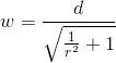
function getWidth(length, ratio) {
  var width = ((length)/(Math.sqrt((1)/(Math.pow(ratio, 2)+1))));
  return Math.round(width);
}
в этом примере я использую 16:10 так как это типичное соотношение сторон монитора.
var ratio = (16/10);
var height = getHeight(300,ratio);
var width = getWidth(height,ratio);

console.log(height);
console.log(width);
результаты сверху были бы 147 и 300
на самом деле я только что столкнулся с этой проблемой, и решение, которое я нашел, было странно простым и странным
$("#someimage").css({height:<some new height>})
и чудесным образом изображение изменяется на новую высоту и сохраняет то же соотношение!
тут <img src="/path/to/pic.jpg" style="max-width:XXXpx; max-height:YYYpx;" > помочь?
браузер позаботится о сохранении пропорций нетронутыми.
Я.е max-width срабатывает, когда ширина изображения больше высоты, и его высота будет рассчитываться пропорционально. Аналогично max-height будет действовать, когда высота больше ширины.
для этого вам не нужен jQuery или javascript.
поддерживается ie7+ и другими браузерами (http://caniuse.com/minmaxwh).
есть 4 параметра для этой проблемы
- текущая ширина изображения iX
- текущая высота изображения iY
- целевая ширина видового экрана cX
- целевая высота смотрового окна cY
и есть 3 различных условных параметра
- cX > cY ?
- iX > cX ?
- iY > cY ?
решение
- найдите меньшую сторону порта целевого вида F
- найдите большую сторону текущего порта просмотра L
- найти коэффициент обоих F / L = factor
- умножьте обе стороны текущего порта на коэффициент ie, fX = iX * factor; fY = iY * factor
это все, что вам нужно сделать.
//Pseudo code


iX;//current width of image in the client
iY;//current height of image in the client
cX;//configured width
cY;//configured height
fX;//final width
fY;//final height

1. check if iX,iY,cX,cY values are >0 and all values are not empty or not junk

2. lE = iX > iY ? iX: iY; //long edge

3. if ( cX < cY )
   then
4.      factor = cX/lE;
   else
5.      factor = cY/lE;

6. fX = iX * factor ; fY = iY * factor ;
это зрелый форум, Я не даю вам код для этого:)
Это должно работать для изображений со всеми возможными пропорциями
$(document).ready(function() {
    $('.list img').each(function() {
        var maxWidth = 100;
        var maxHeight = 100;
        var width = $(this).width();
        var height = $(this).height();
        var ratioW = maxWidth / width;  // Width ratio
        var ratioH = maxHeight / height;  // Height ratio

        // If height ratio is bigger then we need to scale height
        if(ratioH > ratioW){
            $(this).css("width", maxWidth);
            $(this).css("height", height * ratioW);  // Scale height according to width ratio
        }
        else{ // otherwise we scale width
            $(this).css("height", maxHeight);
            $(this).css("width", height * ratioH);  // according to height ratio
        }
    });
});
$('#productThumb img').each(function() {
    var maxWidth = 140; // Max width for the image
    var maxHeight = 140;    // Max height for the image
    var ratio = 0;  // Used for aspect ratio
    var width = $(this).width();    // Current image width
    var height = $(this).height();  // Current image height
    // Check if the current width is larger than the max
    if(width > height){
        height = ( height / width ) * maxHeight;

    } else if(height > width){
        maxWidth = (width/height)* maxWidth;
    }
    $(this).css("width", maxWidth); // Set new width
    $(this).css("height", maxHeight);  // Scale height based on ratio
});
Если изображение пропорционально, то этот код заполнит обертку изображением. Если изображение не пропорционально, дополнительная ширина / высота будет обрезана.
    <script type="text/javascript">
        $(function(){
            $('#slider img').each(function(){
                var ReqWidth = 1000; // Max width for the image
                var ReqHeight = 300; // Max height for the image
                var width = $(this).width(); // Current image width
                var height = $(this).height(); // Current image height
                // Check if the current width is larger than the max
                if (width > height && height < ReqHeight) {

                    $(this).css("min-height", ReqHeight); // Set new height
                }
                else
                    if (width > height && width < ReqWidth) {

                        $(this).css("min-width", ReqWidth); // Set new width
                    }
                    else
                        if (width > height && width > ReqWidth) {

                            $(this).css("max-width", ReqWidth); // Set new width
                        }
                        else
                            (height > width && width < ReqWidth)
                {

                    $(this).css("min-width", ReqWidth); // Set new width
                }
            });
        });
    </script>
без дополнительных temp-vars или скобок.
    var width= $(this).width(), height= $(this).height()
      , maxWidth=100, maxHeight= 100;

    if(width > maxWidth){
      height = Math.floor( maxWidth * height / width );
      width = maxWidth
      }
    if(height > maxHeight){
      width = Math.floor( maxHeight * width / height );
      height = maxHeight;
      }
имейте в виду: поисковым системам это не нравится, если атрибут width и height не соответствует изображению, но они не знают JS.
после некоторых проб и ошибок я пришел к этому решению:
function center(img) {
    var div = img.parentNode;
    var divW = parseInt(div.style.width);
    var divH = parseInt(div.style.height);
    var srcW = img.width;
    var srcH = img.height;
    var ratio = Math.min(divW/srcW, divH/srcH);
    var newW = img.width * ratio;
    var newH = img.height * ratio;
    img.style.width  = newW + "px";
    img.style.height = newH + "px";
    img.style.marginTop = (divH-newH)/2 + "px";
    img.style.marginLeft = (divW-newW)/2 + "px";
}
изменение размера может быть достигнуто (поддержание соотношения сторон) с помощью CSS. Это еще один упрощенный ответ, вдохновленный сообщением Дэна Даскалеску.
img{
     max-width:200px;
 /*Or define max-height*/
  }
<img src="http://e1.365dm.com/13/07/4-3/20/alastair-cook-ashes-profile_2967773.jpg" alt="Alastair Cook" />
<img src="http://e1.365dm.com/13/07/4-3/20/usman-khawaja-australia-profile_2974601.jpg" alt="Usman Khawaja"/>вот исправление к ответу Мехдивея. Новая ширина и / или высота не были установлены на максимальное значение. Хорошим тестовым случаем является следующий (1768 X 1075 пикселей):http://spacecoastsports.com/wp-content/uploads/2014/06/sportsballs1.png. (Я не смог прокомментировать это выше из-за отсутствия очков репутации.)
  // Make sure image doesn't exceed 100x100 pixels
  // note: takes jQuery img object not HTML: so width is a function
  // not a property.
  function resize_image (image) {
      var maxWidth = 100;           // Max width for the image
      var maxHeight = 100;          // Max height for the image
      var ratio = 0;                // Used for aspect ratio

      // Get current dimensions
      var width = image.width()
      var height = image.height();
      console.log("dimensions: " + width + "x" + height);

      // If the current width is larger than the max, scale height
      // to ratio of max width to current and then set width to max.
      if (width > maxWidth) {
          console.log("Shrinking width (and scaling height)")
          ratio = maxWidth / width;
          height = height * ratio;
          width = maxWidth;
          image.css("width", width);
          image.css("height", height);
          console.log("new dimensions: " + width + "x" + height);
      }

      // If the current height is larger than the max, scale width
      // to ratio of max height to current and then set height to max.
      if (height > maxHeight) {
          console.log("Shrinking height (and scaling width)")
          ratio = maxHeight / height;
          width = width * ratio;
          height = maxHeight;
          image.css("width", width);
          image.css("height", height);
          console.log("new dimensions: " + width + "x" + height);
      }
  }
взгляните на эту часть...
/**
 * @param {Number} width
 * @param {Number} height
 * @param {Number} destWidth
 * @param {Number} destHeight
 *
 * @return {width: Number, height:Number}
 */
function resizeKeepingRatio(width, height, destWidth, destHeight)
{
    if (!width || !height || width <= 0 || height <= 0)
    {
        throw "Params error";
    }
    var ratioW = width / destWidth;
    var ratioH = height / destHeight;
    if (ratioW <= 1 && ratioH <= 1)
    {
        var ratio = 1 / ((ratioW > ratioH) ? ratioW : ratioH);
        width *= ratio;
        height *= ratio;
    }
    else if (ratioW > 1 && ratioH <= 1)
    {
        var ratio = 1 / ratioW;
        width *= ratio;
        height *= ratio;
    }
    else if (ratioW <= 1 && ratioH > 1)
    {
        var ratio = 1 / ratioH;
        width *= ratio;
        height *= ratio;
    }
    else if (ratioW >= 1 && ratioH >= 1)
    {
        var ratio = 1 / ((ratioW > ratioH) ? ratioW : ratioH);
        width *= ratio;
        height *= ratio;
    }
    return {
        width : width,
        height : height
    };
}
2 шагов:
Шаг 1) вычислите отношение исходной ширины / исходной высоты изображения.
Шаг 2) умножьте соотношение original_width/original_height на новую желаемую высоту, чтобы получить новую ширину, соответствующую новой высоте.
это полностью сработало для меня для перетаскиваемого элемента-aspectRatio: true
.appendTo(divwrapper).resizable({
    aspectRatio: true,
    handles: 'se',
    stop: resizestop
})