QML ComboBox элемент DropDownMenu стиль
Я хочу использовать ComboBox введите мой проект. Можно ли изменить вид выпадающего меню (цвет, форма, стиль текста) или мне нужно использовать комбинацию прямоугольников, ListViews и другие типы?
следующий код применяет настройки, но для выпадающего меню, которое остается серым, не определено никаких изменений:
ComboBox {
    currentIndex: 2
    activeFocusOnPress: true
    style: ComboBoxStyle {
        id: comboBox
        background: Rectangle {
            id: rectCategory
            radius: 5
            border.width: 2
            color: "#fff"

            Image {
                source: "pics/corner.png"
                anchors.bottom: parent.bottom
                anchors.right: parent.right
                anchors.bottomMargin: 5
                anchors.rightMargin: 5
            }
        }
        label: Text {
            verticalAlignment: Text.AlignVCenter
            horizontalAlignment: Text.AlignHCenter
            font.pointSize: 15
            font.family: "Courier"
            font.capitalization: Font.SmallCaps
            color: "black"
            text: control.currentText
        }
    }

    model: ListModel {
        id: cbItems
        ListElement { text: "Banana" }
        ListElement { text: "Apple" }
        ListElement { text: "Coconut" }
    }
    width: 200
}
3 ответов
текущие общедоступные API не позволяют настраивать раскрывающееся меню, как указано здесь. Qt 5.4, то есть Styles 1.3, просто ввел некоторые свойства для настройки шрифтов и текста (docs здесь), но по-прежнему нет публичного доступа к раскрывающейся настройке.
кроме того, пример, приведенный в ссылке не работает с более новыми версиями Qt. Вот модифицированная версия, которую я тестировал с Qt 5.3, Qt 5.4 и Qt 5.5 (не забудьте добавить import QtQuick.Controls.Private 1.0 к imports):
ComboBox {
    id: box
    currentIndex: 2
    activeFocusOnPress: true
    style: ComboBoxStyle {
        id: comboBox
        background: Rectangle {
            id: rectCategory
            radius: 5
            border.width: 2
            color: "#fff"
        }
        label: Text {
            verticalAlignment: Text.AlignVCenter
            horizontalAlignment: Text.AlignHCenter
            font.pointSize: 15
            font.family: "Courier"
            font.capitalization: Font.SmallCaps
            color: "black"
            text: control.currentText
        }

        // drop-down customization here
        property Component __dropDownStyle: MenuStyle {
            __maxPopupHeight: 600
            __menuItemType: "comboboxitem"

            frame: Rectangle {              // background
                color: "#fff"
                border.width: 2
                radius: 5
            }

            itemDelegate.label:             // an item text
                Text {
                verticalAlignment: Text.AlignVCenter
                horizontalAlignment: Text.AlignHCenter
                font.pointSize: 15
                font.family: "Courier"
                font.capitalization: Font.SmallCaps
                color: styleData.selected ? "white" : "black"
                text: styleData.text
            }

            itemDelegate.background: Rectangle {  // selection of an item
                radius: 2
                color: styleData.selected ? "darkGray" : "transparent"
            }

            __scrollerStyle: ScrollViewStyle { }
        }

        property Component __popupStyle: Style {
            property int __maxPopupHeight: 400
            property int submenuOverlap: 0

            property Component frame: Rectangle {
                width: (parent ? parent.contentWidth : 0)
                height: (parent ? parent.contentHeight : 0) + 2
                border.color: "black"
                property real maxHeight: 500
                property int margin: 1
            }

            property Component menuItemPanel: Text {
                text: "NOT IMPLEMENTED"
                color: "red"
                font {
                    pixelSize: 14
                    bold: true
                }
            }

            property Component __scrollerStyle: null
        }
    }

    model: ListModel {
        id: cbItems
        ListElement { text: "Banana" }
        ListElement { text: "Apple" }
        ListElement { text: "Coconut" }
    }
    width: 200
}
здесь __dropDownStyle назначен с MenuStyle тип. Некоторые свойства такого типа настраиваются для получения нужного стиля, в частности itemDelegate (который определяет внешний вид элемента внутри combobox) и frame (общий фон). Обратитесь к связанному MenuStyle API для более подробной информации. Общий результат:
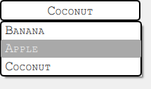
обратите внимание, что такой подход отлично работает на Windows и Android, тогда как на OSX код полностью игнорируется. Можно проверить файл стиля qml внутри установки Qt (поиск вложенного пути, такого как qml/QtQuick/Controls/Styles/Desktop), чтобы увидеть, какие изменения w.r.т. Windows и попробуйте адаптировать предоставленное решение. Эта часть оставлена на усмотрение читателя.
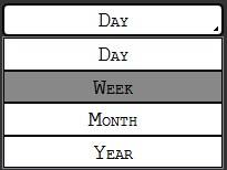
большое спасибо! Я решил это следующим кодом:
Item {
id: app
width: 200
height: 150

ListModel{
    id: dataModel
    ListElement{ name: "Day" }
    ListElement{ name: "Week" }
    ListElement{ name: "Month" }
    ListElement{ name: "Year" }
}

Button {
    id: comboButton
    width: parent.width
    height: parent.height / 5
    checkable: true

    style: ButtonStyle {
       background: Rectangle {
           color: control.pressed ? "#888" : "#fff"
           smooth: true
           radius: 5
           border.width: 2

           Image {
               source: "pics/corner.png"
               anchors.bottom: parent.bottom
               anchors.right: parent.right
               anchors.bottomMargin: 5
               anchors.rightMargin: 5
           }
       }
       label: Text {
            renderType: Text.NativeRendering
            verticalAlignment: Text.AlignVCenter
            horizontalAlignment: Text.AlignHCenter
            font.family: "Courier"
            font.capitalization: Font.SmallCaps
            font.pointSize: 15
            color: "black"
            text: "Day"
        }
    }
    onVisibleChanged: {
        if(!visible)
            checked = false
    }
}

TableView {
    id: tableView
    height: 120
    width: parent.width
    anchors.bottom: parent.bottom
    highlightOnFocus: true
    headerVisible: false
    visible: comboButton.checked ? true : false

    TableViewColumn {
        role: "name"
    }
    model: dataModel

    itemDelegate: Item {
        Rectangle {
            color: styleData.selected  ? "#888" : "#fff"
            height: comboButton.height - 0.5
            border.width: 0.5
            width: parent.width

            Text {
                renderType: Text.NativeRendering
                anchors.verticalCenter: parent.verticalCenter
                anchors.horizontalCenter: parent.horizontalCenter
                font.family: "Courier"
                font.capitalization: Font.SmallCaps
                font.pointSize: 15
                color: "black"
                elide: styleData.elideMode
                text: styleData.value
            }
        }
    }

    rowDelegate: Item {
        height: comboButton.height - 0.5
    }

    onClicked: {
       comboButton.checked = false
       tableView.selection.clear()
    }
}
}
я использовал такие подходы, но у них есть много ограничений с focus управления и z-index управление.
Я в конечном итоге с осуществлением ComboBox который состоит из 2 частей: заголовок, который вы фактически помещаете куда-то, и раскрывающийся компонент, который вы создаете динамически. Последний состоит из Item охватывая все (и перехватывая активность мыши) и раскрывающийся список, который тщательно расположен под заголовком.
код довольно массивный, чтобы включить здесь, чтобы вы могли видеть детали в моем блоге со всем кодом