В WPF круговой границы
Как я могу создать круговой Border, который может содержать другие элементы пользовательского интерфейса?
что-то вроде этого: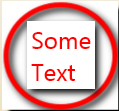
есть ли простой способ достижения аналогичного эффекта?
6 ответов
работает с MultiValueConverter:
public class CircleMarginConverter : IMultiValueConverter
{
    public object Convert(object[] values, Type targetType, object parameter, System.Globalization.CultureInfo culture)
    {
        var width = (double)values[0];
        var height = (double)values[1];
        var diagonal = Math.Sqrt(width * width + height * height);
        var horzmargin = (diagonal - width) / 2;
        var vertmargin = (diagonal - height) / 2;
        return new Thickness(horzmargin,vertmargin,horzmargin,vertmargin);
    }

    public object[] ConvertBack(object value, Type[] targetTypes, object parameter, System.Globalization.CultureInfo culture)
    {
        throw new NotImplementedException();
    }
}
со следующим Usercontrol:
<UserControl x:Class="CircleBorderTest.CircleBorder"
             xmlns="http://schemas.microsoft.com/winfx/2006/xaml/presentation"
             xmlns:x="http://schemas.microsoft.com/winfx/2006/xaml"
             xmlns:mc="http://schemas.openxmlformats.org/markup-compatibility/2006"
             xmlns:local="clr-namespace:CircleBorderTest"
             xmlns:d="http://schemas.microsoft.com/expression/blend/2008"
             mc:Ignorable="d"
             d:DesignHeight="300" d:DesignWidth="300">
    <UserControl.ContentTemplate>
        <DataTemplate DataType="UserControl">
            <DataTemplate.Resources>
                <local:CircleMarginConverter x:Key="CircleMarginConverter"/>
            </DataTemplate.Resources>
            <Grid VerticalAlignment="Center" HorizontalAlignment="Center">
                <ContentPresenter Content="{TemplateBinding Content}">
                    <ContentPresenter.Margin>
                        <MultiBinding Converter="{StaticResource CircleMarginConverter}">
                            <Binding Path="ActualWidth" RelativeSource="{RelativeSource Self}"/>
                            <Binding Path="ActualHeight" RelativeSource="{RelativeSource Self}"/>
                        </MultiBinding>
                    </ContentPresenter.Margin>
                </ContentPresenter>
                <Ellipse HorizontalAlignment="Stretch" VerticalAlignment="Stretch" Stroke="Red" StrokeThickness="1px"/>
            </Grid>
        </DataTemplate>
    </UserControl.ContentTemplate>
</UserControl>
и используется следующим образом:
<Window x:Class="CircleBorderTest.MainWindow"
        xmlns="http://schemas.microsoft.com/winfx/2006/xaml/presentation"
        xmlns:x="http://schemas.microsoft.com/winfx/2006/xaml"
        xmlns:local="clr-namespace:CircleBorderTest"
        Title="MainWindow" Height="350" Width="525">
    <local:CircleBorder>
        yeah
    </local:CircleBorder>
</Window>
это изменяет размер с содержимым. Вы можете использовать это как стиль на любом ContentControl вам нравится.
простой способ сделать это;
<Border x:Name="circularBorder"
   CornerRadius="{Binding Path=ActualHeight, ElementName=circularBorder}"
   Width="{Binding Path=ActualHeight, ElementName=circularBorder}">
</Border>
теперь у вас есть круговая граница во всех типах экранов
в идеале, вы могли бы просто использовать Ellipse для этого, но к сожалению он не может держать контент напрямую.
следующая догадка может заключаться в создании шаблона для вашего Border, а Border нет Template собственность, так что тоже...
к счастью, есть рабочий раунд-вы можете использовать ContentControl, templated следующим образом:
        <Style TargetType="ContentControl">
            <Setter Property="Template">
                <Setter.Value>
                    <ControlTemplate TargetType="ContentControl">
                        <Grid>
                            <Ellipse
                Width="{TemplateBinding Width}" Height="{TemplateBinding Height}" Stroke="Red" StrokeThickness="3">
                                <Ellipse.Effect>
                                    <DropShadowEffect
                        BlurRadius="18" Direction="-20" ShadowDepth="12" />
                                </Ellipse.Effect>
                            </Ellipse>
                            <ContentPresenter
                                HorizontalAlignment="Center" VerticalAlignment="Center" />
                        </Grid>
                    </ControlTemplate>
                </Setter.Value>
            </Setter>
        </Style>
использование:
    <ContentControl>
        <Border BorderBrush="Black" BorderThickness="2" HorizontalAlignment="Center" VerticalAlignment="Center"
                    Height="120" Width="120">
            <TextBlock FontSize="24" Text="Some Text" />
        </Border>
    </ContentControl>
вы можете нарисовать круг на фоне и компенсировать его содержимое заполнением (его толщина будет привязана к размеру границы).
Я думаю, если у вас есть границы с Width=Height=X, потом в CornerRadius для X / 2 должен дать правильный результат.
тогда прокладка будет вдоль 0.3 X, чтобы внутренние органы управления не пересекали край. Возможно, захотите поиграть с этим последним номером, у меня нет времени, чтобы разобраться.
мое решение было бы (но, конечно, граница с радиусом закругления проще ):
<Border Margin="0,15,0,0" Height="75" Width="75">
    <Grid Width="{Binding Path=ActualWidth, RelativeSource={RelativeSource PreviousData}}"
    Height="{Binding Path=ActualHeight, RelativeSource={RelativeSource PreviousData}}" >
    <Ellipse Width="{Binding Path=Width, RelativeSource={RelativeSource Mode=FindAncestor, AncestorType=Border}}"
        Height="{Binding Path=Height, RelativeSource={RelativeSource Mode=FindAncestor, AncestorType=Border}}"
        Stroke="White" StrokeThickness="1"/>
        <Border Width="{Binding Path=Width, RelativeSource={RelativeSource Mode=FindAncestor, AncestorType=Border}}"
             Height="{Binding Path=Height, RelativeSource={RelativeSource Mode=FindAncestor, AncestorType=Border}}"
             VerticalAlignment="Center" HorizontalAlignment="Center">
            <TextBlock HorizontalAlignment="Center" VerticalAlignment="Center" Margin="0,0,1,1">
                 <StackPanel Orientation="Vertical" HorizontalAlignment="Center" >
                     <TextBlock Foreground="White" FontSize="18" FontFamily="{StaticResource RobotoFont}"
                          FontWeight="DemiBold"
                          HorizontalAlignment="Center" Text="0"/>
                     <TextBlock Foreground="White" FontSize="12" FontFamily="{StaticResource ResourceKey=RobotoFont}" FontStyle="Normal"
                                HorizontalAlignment="Center" Text="Selected"/>
                </StackPanel>
            </TextBlock>
        </Border>
    </Grid>
</Border>